

On Thursday, ESPN announced that they’re making an audacious change to their MLB broadcasts. Starting this year, the scoreboard graphic during their baseball games will feature a line showing the win probability of the game, and the line will be visible pretty much the entire time – meaning you’ll get to see it move from one direction to another with every pitch depending on who’s deemed more likely to win.
What’s significantly harder to quantify, however, than who is more likely to win a baseball game is how much I absolutely despise this “innovation,” because it’s not only horrendous and annoying in all the ways that are immediately intuitive, it’s awful because of the ulterior, sinister reason for its existence and the slippery slope that this seemingly-innocuous change has the potential to usher in to sports broadcasts forever.
First though, let’s talk about the basic reasons for why I hate hate this addition. The first and most obvious reason is that it’s unnecessary. It’s not just that this is not at all information essential enough that it needs to be on screen on the entire time; it’s not just that no one’s been clamoring for this; it’s not just that it’s incredibly distracting; and it’s not just that this will inevitably breed resentment against the network and its announcers as sports fans invariably interpret the graphic as proof that ESPN itself is biased against their favorite team; it’s that having a graphic on screen constantly affirming that one side is clearly more likely to win the other will actually make us less invested in these games.
I watch sporting events because I enjoy the unpredictability of them; I watch them because I like believing that the outcome isn’t set in stone and that anything could happen in them. The last thing I want is a permanent, Neil deGrasse Tyson-esque buzz-killing line on screen reinforcing the whole time that the thing I’m watching is actually less competitive than what my mind wants it to be. Not only will this win probability bar not make me more immersed in ESPN’s baseball games, it’s going to have the opposite effect. If a game reaches a point where a team has a 2-0 lead and the graphic says they have an 85% chance of victory, my mind isn’t going to think “Hmm, I can’t wait to see if the other team can overcome these seemingly-insurmountable odds.” No, I’m going to think “Oh… well if their lead is that commanding, I guess I don’t need to watch this anymore” and then change the channel.
Another problem I have with this is that this information just isn’t very useful. It’s true that sports fans do like to share the win probability charts of games on social media, but you’ll notice that they only like to share them after the game is over – when it’s fun to pinpoint the moments when the outcome changed on its head. Seeing the win probability live on a scoreboard, however, when fans are devoid of being able to look back and know which moments mattered the most, defeats the entire purpose of why they look it up in the first place – and that’s on top of the fact that sports fans primarily do it to see an accompanying graph of the win probability, which a scorebug is inherently incapable of providing in real time.
87% win probability with less than a minute left.
They lost by 2.
Can’t make this stuff up pic.twitter.com/P02w0Aic33
— Damien Bartonek (@tvBartonek) March 8, 2024
Because of that, sports fans are inevitably going to keep going to apps to look up the specifics of a game’s win probability anyway, which renders the whole exercise of having a less comprehensive version of that same information on screen for the entire game a colossal waste of time.
Then there’s the fact that win probability statistic itself isn’t all that interesting the vast majority of the time. There’s a reason sports fans aren’t constantly, second-by-second monitoring the win probability of a sporting event on their phones, and it’s because that information only really works an accompaniment to the score after it’s finished, to revel in the last-second peaks and valleys of what we just saw. In real time, however, that information comes off purely a redundant.
We don’t need a graphic telling us which team is more likely to win at all times because, well, we’re watching the game and are capable of comprehending what the score is and what that means. If your team is down 3-0, you don’t need a stat confirming that your team is more likely to lose than it is to win – never mind an exact calculation of that stat.
Plus, anyone who’s ever looked at a win probability chart will tell you that it’s rare for a game’s outcome to change too substantially anyway prior to the final period. During most close games, the win probability is almost never skewed too highly for either side until the end unless there’s a gargantuan comeback in the middle of it. In other words, the team leading in win probability is usually going to be doing so with either a relatively tight margin – meaning the stat itself won’t be all that predictive given how close the score is – or it’ll be completely predictive because the game will be such a blowout that the win probability is gigantic. In neither scenario is that information going to be serving a compelling purpose for viewers. Case in point: how often do you ever see a person share a win probability chart from a normal game in which there wasn’t a thrilling last-second, game-changing play? The answer is never.
But here’s the biggest reason to look at this win probability graphic and rue its existence: it’s a gateway to putting live moneyline figures on scoreboard bugs instead. Let’s be real: there is one and only one demographic of sports viewers who could possibly be served by having this stat on screen, and that’s the gamblers who are or could be wagering on that game. Having a win probability graphic up serves as reassurance to betters that a game’s outcome may or may not be pointing in a direction that’s favorable to them.
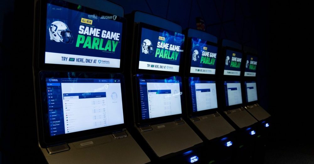
Cincinnati’s FanDuel sportsbook at Belterra Park
It’s a graphic that’s there to tap into their addiction, to subliminally encourage them to make a live bet given what the expected outcome of the game is. It’s why in a media call on Thursday, ESPN vice president of production Phil Orlins spoke at length about why they’d decided to add this graphic and only once gave something approximating an actual reason to do it. “I think it just speaks to the way people think about sports right now, the consciousness of it, it’s on every website,” he said. “People who obviously have a wager on the game have maybe a little more thought about it as well.”
Therein lies the true threat of ESPN’s new win probability graphic. On the surface, you might find it little more than a trifle – the kinda thing that’s annoying but not worth getting too bent out of shape about. But that’s the trick. It’s there to get us accustomed to seeing a projection line right next to the score, but it’s a graphic that most sports fans don’t really care about and that gamblers might be into but would be better served if it showed the game’s live moneyline odds instead.
So how much do you want to wager that ESPN, a company that runs its own sportsbook now and produces oodles of sports betting content, is eventually going to go all the way with this and transform that win probability graphic into a moneyline graphic? Because I’d stake anything on it.
The odds of ESPN going out of its way to add this graphic and getting people familiar with something like it and then never following through and going all the way to fully appeal to the type of people who they did this for in the first place is so low that it’s practically nothing. A win probability graphic isn’t the end game, it’s a trojan horse to getting figures that look like “-110” and “+110” on every scoreboard on the network, pollinating to basketball and football and soccer and golf and so on. And if it catches on at ESPN, it catches on everywhere, and suddenly it could become impossible to watch a sporting event in America without having a gambling line thrust in your face for the duration of it.
“I’m 100 percent sure that backlash will diminish over time and people will get used to it and ultimately begin to expect it,” was another thing Phil Orlins said on Thursday about the win probability graphic. And he might be right. After all, viewers have gotten to used to seeing a gigantic, superfluous arrow superimposed onto the field of every NFL broadcast these days. But that doesn’t mean that that arrow is actually good or informative or that anyone would actually miss it if they got used to it not being there, and the same will be true if baseball fans learn to live with ESPN’s win probability meter.
The consequences will be worse though. This new graphic is dumb and unnecessary and tacky and distracting, but the worst thing about it is the pandora’s box of gambling integration that could follow in its wake. It is not at all unthinkable that if this catches on, we might one day look back at the integration of this graphic as the moment sports broadcasts became 100%, inescapably swallowed by gambling. ESPN didn’t install this thing that they knew baseball fans would hate out of the gate just for the hell of it. They did it to see how much further than they can go, and if they’re allowed to go any further, the next evolution of this will be bad enough that fans will wish they had protested the live win probability meter while they still had the chance. You can bet on it.
[Devin Raab is on Twitter and Bluesky @velodus]