
One of the silly things we like to over-analyze a bit here at Awful Announcing is scorebugs. You know, the little box that shows up on the screen with information like the score, the yardage situation, timeouts, the count, and so on. We hadn’t really seen a large change from ESPN in recent years, but they started the bowl season a couple of weeks ago with a bang and a new graphic. After the graphic went into hiding, it re-emerged during the New Year’s Six bowl games and the Panthers-Cardinals playoff game.
In case you missed it, here’s a look at the graphic from the Sugar Bowl.
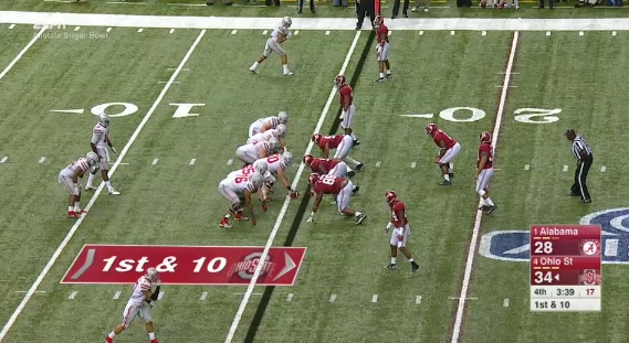
The reception from fans was pretty clearly split. Some liked the clean look of the graphic, as it looks very similar to the new SportsCenter graphics we saw rolled out over the summer. Others feel that it’s bulky, and the time and down are way too small. But then again, if the time and situation were made larger, wouldn’t the graphic become even *more* bulky?
The placement on football games can also be problematic, potentially obscuring a linebacker or member of the secondary creeping forward.
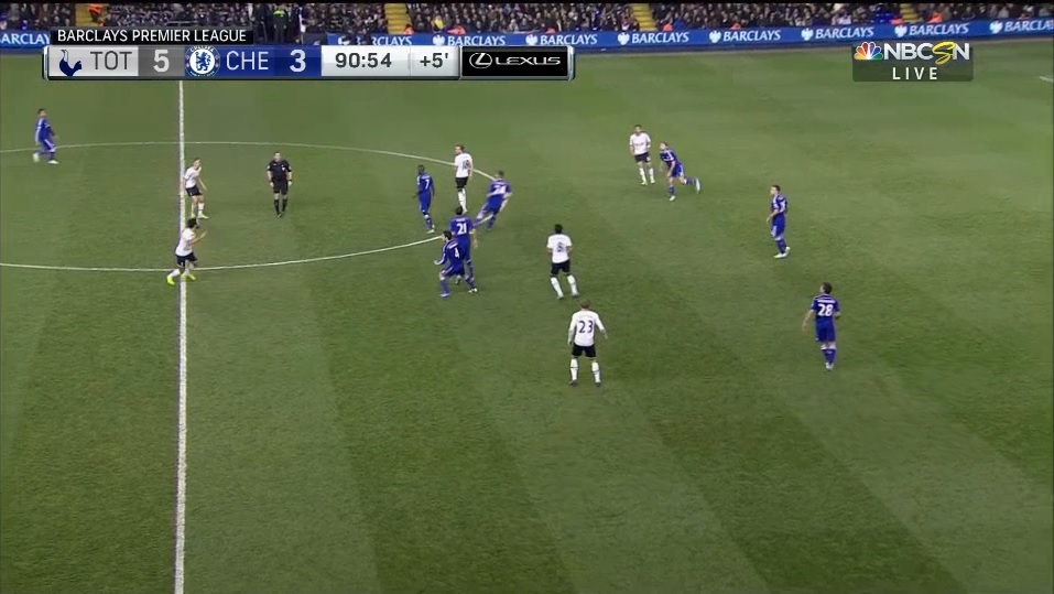
NBC’s new graphics package is also quite clean. Here’s what it looks like for the Premier League.

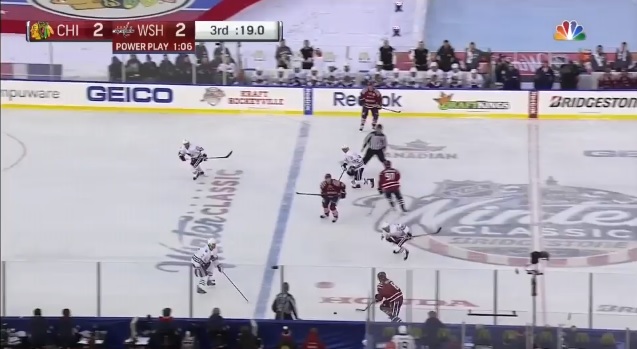
And the NHL.
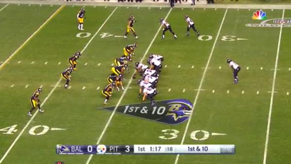
And the NFL, ahead of the network’s broadcast of the Super Bowl.
NBC’s new scorebugs are clean, much like ESPN’s. Unlike the new ESPN graphic, NBC has dumped their score as far out of the way as possible – look at how the Premier League graphic is very nearly covering the boards on the field, and look at how the NHL graphic is off beyond the glass. Fans won’t be missing much action at all with the NHL graphic, and won’t be missing all that much with the EPL graphic.
Fox’s new soccer graphics package during the FA Cup also got some attention this weekend, but actually was rolled out during the summer’s International Champions Challenge. Just for the hell of it, here you go, but remember – Fox uses different graphics for the Champions League stages that we’ve seen so far this season.
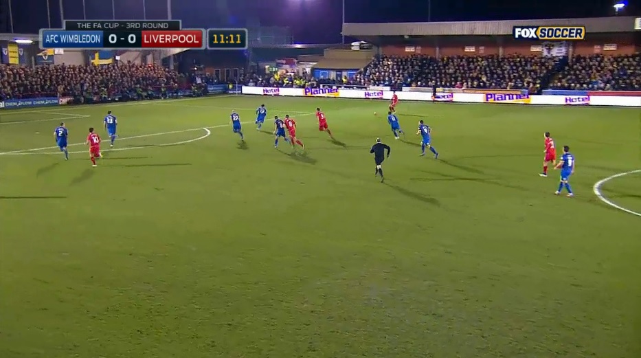
Again – very clean and unobtrusive. However, spelling out the entire name of the club makes the graphic a little larger that I might like.
There was also a strange quirk that arose during Fox’s FA Cup coverage on Monday – during the second half of Wimbledon-Liverpool, the graphics flipped back to the international feed.
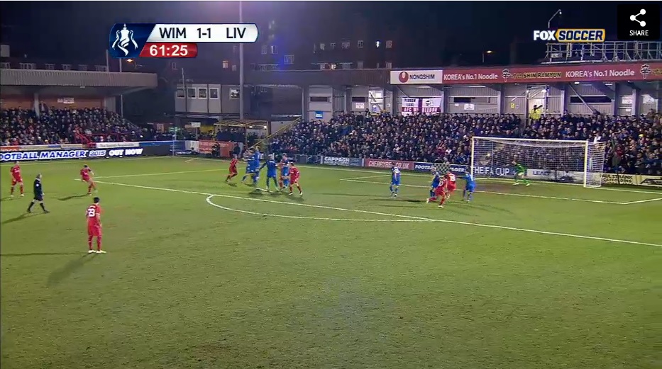
(the share button isn’t part of the graphics package, it just wouldn’t disappear when screencapping the video)
All in all, I think we’re seeing a trend here, going towards more crisp, colorful graphics largely placed in the corners instead of blockier, monochromatic graphics with a splash or two of color. Look at the ESPN graphic – no black aside from the time and down script. Look at the NBC graphics – the only black is again on the time. Fox flipped the script by going with white text on a black background for the score, and yellow text on a black background for the time.
What I think is most notable about the new graphics packages are how noticeable they are. You’re not going to confuse the score with that of another game, and they’re not creating an even larger chunk to cut out of the field of play when the bottom line (which is a different subject for a different time) is also featured.
If I had to rank the new graphics, I’d go NBC first, ESPN second, and Fox third, though that’s not as much of a slight on Fox and more praise of the other two networks. Because we haven’t really seen many games broadcast with the new graphics yet, I’m curious as to whether or not more changes will be coming as the NHL, Premier League, and college basketball seasons roll on.
