
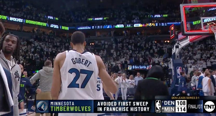
On-broadcast graphics on how a sports event compares to history can be great or not-so-great. One important consideration there is if something is actually notable. Another is then if it’s possible to present it completely accurately in a graphic, particularly in a way that accounts for any potential caveats or exceptions. A NBA on TNT graphic Sunday night, about the Minnesota Timberwolves’ 114-108 overtime win in Game Four of their first-round NBA Playoffs series against the Denver Nuggets, failed to hit those marks for many. Here’s that graphic, via Michael Pina of The Ringer:
"avoided first sweep in franchise history" deserves to hang from the rafters pic.twitter.com/1ShIW06LDn
— Michael Pina (@MichaelVPina) April 24, 2023
Let’s start with the discussion of accuracy. It is true that if the Timberwolves had lost this game, that would have marked their first 4-0 loss in a seven-game series. However, the NBA’s playoff format has undergone significant change over the years, with the current first round (conference quarterfinals) only being extended to a best-of-seven series in 2003.
From the start of the current first round in 1975 through 1981, that was a best-of-three series, and from 1982-2002, it was a best-of-five. The Timberwolves entered the NBA as an expansion franchise in 1989, and they were swept 3-0 in the first round in both 1997 and 2002. So “avoided first sweep in franchise history” isn’t fully accurate, at least without an added caveat of “avoided first 4-0 sweep in franchise history” or something similar. It’s perhaps not as blatant of a graphic error as wildly–wrong scores, teams, names, series results, or geography, and it’s not errant placeholder text, but this still isn’t correct in terms of the generally-accepted definition of sweep (winning a series in the shortest amount of games possible).
Beyond that, there’s the question of notability. And that’s an important one with graphics in particular relative to just on-broadcast discussion; the graphics provide an accompanying visual element, making whatever’s being discussed feel more significant, and they also have the potential to live on through screengrabs rather than just clipped videos. If the announcing team had just mentioned that a loss here would have been the first time the Timberwolves had been swept in a seven-game series, that probably wouldn’t have drawn a lot of discussion.
But the graphic escalated this significantly, and led to a lot of discussion on if this was actually a notable accomplishment. And a lot of that was critical:
Someone make t shirts 😂
— Moth (@mimtclaughlin) April 24, 2023
Yup. Gentlemen’s swept 2023 get the banner up
— Ron (@_Ronny_k) April 24, 2023
Jim Irsay would hang this banner
— OZ (@OrlandoNapoli22) April 24, 2023
Pack this team up.
— Gooden (@DGOODEN83) April 24, 2023
the whole arena cheering while the chyron says “avoided first sweep in franchise history”
im obsessed with the timberwolves
— Matt Ellentuck (@mellentuck) April 24, 2023
This doesn’t seem quite as bad as some extremely and overly specific graphics with selectively-drawn boundaries (“Players with 800 games to average 13.5 points, 5.9 rebounds, 1.4 steals, 49% field goals, 30% three-point field goals,” “17+ hits and 13+ RBIs in first 11 career games vs. Baltimore since 1954“). Sweeps are at least clearly defined and a subject of wider conversation beyond the specific instance here (the prior two examples could be in the “literally no one was asking” meme, while there’s at least a chance people would have talked about avoiding the sweep without TNT pointing it out). But this still felt like an unnecessary graphic even before you get to the previous sweeps in five-game series. And while this could have been accurate with the right disclaimer, tortured disclaimers are problematic too. If this was worth referencing at all, it would have made more sense as announcer discussion without the graphic.
[Michael Pina on Twitter]
