
While some people are wasting their time debating frivolous topics like who should be the MVP or who should be the Defensive Player of the Year in the NBA, I’ve been focusing on a far more important question: which TV broadcaster during the 2022-2023 season had the best NBA scorebug? It’s a question I’ve pondered for months after unconsciously sorting each one in my head whenever I watched a game. And with the regular season finally over, I am at last able to subjectively/definitively answer that question, in order from worst to best.
Let’s begin, shall we?
13. Bally Sports (regional)
Yuck is this thing an eyesore? For one thing, it’s ridiculously inefficient. Look how much space is devoted merely to identifying who the teams are on the left side; it’s criminal to take up that much real estate without at least including the teams’ abbreviations too, and the gigantic red timeout bars underneath don’t help things either. But the coup de gras is that Bally decided to make the right side of the scoreboard an unrelated news ticker, meaning that not only is the whole thing gigantic, but half of it also doesn’t even have anything to do with the actual game. This is the worst NBA scoreboard by a mile this season and its only saving grace is that Bally Sports’ regional network isn’t long for this world, meaning that fans may never have to see these putrid graphics during an NBA game again.
12. ESPN/ABC (national)
On the one hand, this scoreboard registers as progress for ESPN, as it’s only half as large as last year’s screen-polluting abomination. On the other hand, it’s still way too large; there’s no reason for there to be a whole bottom half to it that only conveys how many timeouts are remaining and if a team is in the bonus. And while the attempt to precisely match the teams’ colors to what the teams are wearing is cool, the fonts used in it are wide and bulbous, so much so that it takes a fraction too long to process what each team’s total is. Again, this is a much better scoreboard than last year’s from ESPN, but it’s high time they pull the plug on their big wide NBA scoreboard experiment and go to a smaller, sleeker corner bug like almost everybody else.
11. NBC Sports (regional)

If there was a “Most Disappointing Scorebug” subcategory, NBC Sports would win it in a landslide because their bugs are usually great. (In fact, their one from shortly after Comcast purchased NBC is one of my favorites ever.) This one, however, is unacceptably cramped, especially when one or both teams enter the penalty and a prominent yellow bar pops up that says “BONUS” on it. When that happens, it becomes way too awkward to read it, especially when the Sixers are playing, at which point it can look like there’s a ‘6’ added to whatever Philadelphia’s point total is. Its saving grace is that at least the whole thing is small, but this is still an underwhelming, clunky step backward for NBC Sports.
10. Root Sports (regional)

If this funky-looking scoreboard reminds you of Fox’s second-to-last NFL scoreboard, it’s because it basically is. There’s a lot going on with it, including the fact that it’s both diagonal and actively counts how many fouls there are until the teams are in the bonus. I’ll give it points for being different (even if it’s ironically by mimicking a pre-existing bug), but to me, it’s a tad too garish and distracting. It’s okay in the grand scheme of things, it does its job and it doesn’t take up too much space at least. But it commands a little too much attention, which is the opposite of what it should be going for.
9. TSN (regional)

You know how a video game can control well but still have bad controls if they don’t match up to what players are used to? Well, that’s kind of what’s going on with TSN’s scoreboard, because it has all the components of a good scoreboard but its order is off. For one thing, the overwhelming majority of scoreboard bugs are in the bottom right corner, so seeing one in the bottom left that isn’t specifically built for it like Root Sports’ is bizarre. For another, putting the part with the quarter and time remaining above the part with the actual score is odd-looking and disorienting. It’s not a bad scoreboard in a vacuum, but it’d be better served if it was readjusted to the part of the screen where it wouldn’t stand out so much.
8. Spectrum SportsNet (regional)

The Lakers’ home network hasn’t overhauled their scoreboard in quite a while, which isn’t necessarily a bad thing as their bug is totally fine. It’s small and not that hard to read, which is everything I want out of an NBA scorebug, and even though it forgoes team abbreviations and has a whole section dedicated to timeouts and penalties (which I normally dislike), it’s economical enough that I can live with it. However, it is starting to feel a bit stale, and because a bunch of other scoreboards are now as small as it, it doesn’t stand out for its efficiency as much as it did a few years ago.
7. Altitude Sports (regional)

Altitude’s scoreboard doesn’t look all that dissimilar to the No. 1 scoreboard on this list. It’s well organized and I love that it indicates a team is in the bonus with a plus sign, which I wish would catch on with NBA bugs because it looks so much better than scoreboards that have huge BONUS tabs, ala ESPN’s. Its downsides are that the scorebug could use more of a graphical container around the top and bottom of it, that its timeout bars are too prominent, and that its quarter indicator isn’t spaced well enough, but it’s still a solid entry.
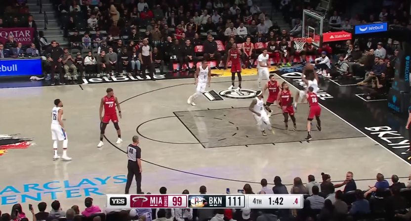
6. MSG (regional)
So here’s the thing: I personally think it’s dumb and unnecessary for NBA scorebugs to A) list how many timeouts teams have left throughout the entire game, because no one cares until it gets to the last minutes of a game and B) list when teams are in the bonus because it’s already obvious when a team is in the bonus because it’s why they’re suddenly able to go to the foul line on regular fouls. I find that information extraneous and deserving of as little graphical attention as possible, and so what I love about MSG’s scoreboard is that not only is their bonus indicator almost microscopic, their timeout bars only appear at the end of the game – which I wish would become the standard in the NBA. On the negative side, the box with the score in it is shaded too much and has too gray a font, which makes it slightly too hard to read the score.
5. Sportsnet One

Sportsnet One, which splits Raptors games with TSN up in Canada, has a deceptively great scoreboard. At first glance, it looks rather minimalistic and plain, not unlike ESPN’s. However, it’s waaaaaaaay better than ESPN’s and is the kind of NBA scorebug that the worldwide leader should emulate. It takes up half as much real estate as ESPN’s, has way better fonts, and manages to list the teams’ timeout and bonus situation in a way that isn’t obnoxious. There’s maybe a little too much white space in it, but this is a very clean and easy-to-read scoreboard that also isn’t that large, so it gets the thumbs up from me.
4. NBATV (national)

I’m a firm believer that sports scoreboards should always be small and unobtrusive so that we can always see as much of the natural beauty of the action as possible. And so what I like about NBA TV’s top-down bug is that it’s both small and out of the way, providing as much information as it can in as squat a container as possible – including the aforementioned plus sign bonus indicator. The only complaint I have with this bug is that its colors and fonts are a tad too plain; it could use a sleeker and more glitzy interface. But otherwise, this is by far the best scoreboard NBA TV’s ever had and hopefully, they won’t stray too far from it if/when they ever change it.
3. YES Network (regional)

YES has always had upper-echelon scorebugs and this is another excellent entry, as it’s easily the smoothest and best-looking graphical container of any bug on this list. The fonts are excellent, the quarter and time indicator section – which is usually the weakest part of NBA scoreboards – looks great, and best of all, they too go the MSG route and only display timeout bars at the end of the game, which I love. The only real problem with the bug is that when those timeout bars and their bonus indicators pop up, the team containers suddenly get very cluttered, which causes too many things to vie for your attention. Still, this was definitely a contender for best of the year.
2. AT&T SportsNet (regional)

Again, I normally dislike scoreboard bugs that only show team logos instead of abbreviations, because I find it a bit tacky. I can make an exception with AT&T SportsNet’s, however, because it takes advantage of the fewer pixels required to show a full logo (as opposed to fully legible letters) by producing an incredibly slim scoreboard. I adore how small and tucked out of the way this thing is, and that it preserves more of the game action than any other bug on this list. Its interface is nothing special and I wish its bonus indicator wasn’t given as much attention (or any), but hey, them’s the breaks if it means getting a scorebug this unobtrusive.
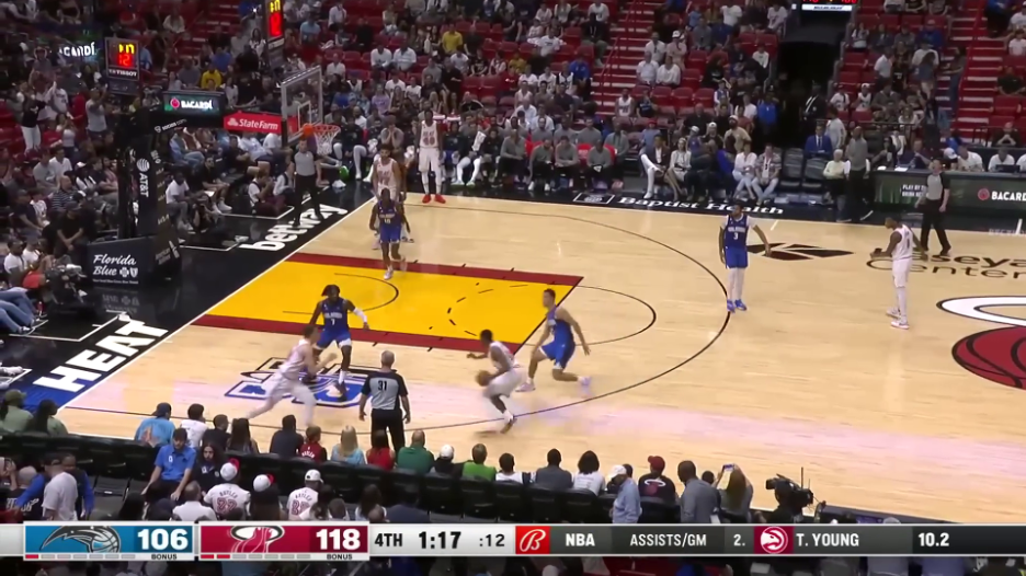
1. TNT (national)

After sticking with the same scoreboard bug for seemingly forever, TNT got a new one this year and the results are great. There are several reasons why I think this is worthy of the No. 1 slot: 1) it’s compact and has no wasted space; 2) it’s the most convenient to keep track of the actual score because it’s the best of the bugs were the scores are stacked on top of each other; and 3), it devotes less screen space to the timeout and bonus info than every other one. Those timeout bars are minuscule and the bonus arrow is a great idea that I can imagine some other scoreboards borrowing in the future.
It’s not a perfect scoreboard though, because the right side of it is a little messy (thanks in no part to TNT’s lame, unimaginative circle logo). If it was up to me, I’d swap the quarter identifier with the clock identifier, remove the shot clock and then have the TNT logo turn into the shot clock whenever it got to 10 or lower. I’d also make the corners rounded around the left edge of it, but only because I have OCD and notice things like that. Otherwise, it’s a very strong scorebug and the best the NBA has to offer this season.