
The start of the 2021 MLB season last week also ushered in the launch of the rebranded Bally Sports RSNs, which also came with new graphics and audio.
The beginning of the year also brought new graphics packages on various other (though, of course, not all) RSNs. That got us wondering: which RSN actually has the best scorebug for MLB games?
It’s worth remembering that nearly all of MLB’s 30 teams are on either an AT&T, Bally, or NBC RSN. By my count, 22 teams have games airing on one of those RSNs (I’m including the Mariners here, though they never rebranded their RSN from Root Sports to AT&T SportsNet, because they still use the AT&T graphics). The other eight teams are on other branded RSNs with their own graphics, adding a few other options to this exercise.
So, which RSN does have the best MLB scorebug? Here’s a look at the ten choices, with some brief thoughts on each.
AT&T SportsNet

There’s some wasted space here with the AT&T logo, and this scorebug could probably be a bit smaller. Overall, I think it’s fine.
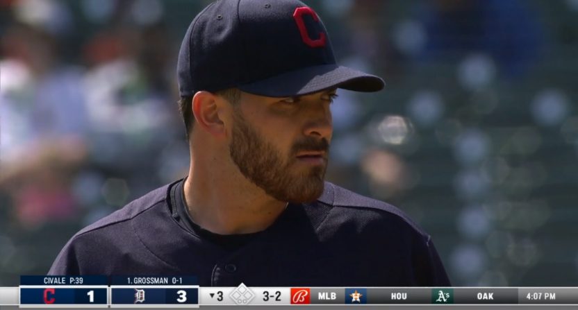
Bally Sports
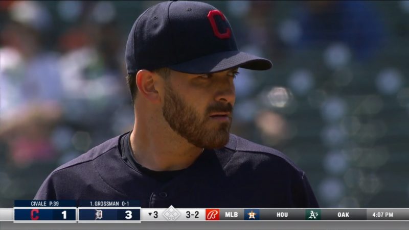
So, the most talked about scorebug of Opening Week was the new Bally graphics package and its combination with the ticker on the bottom of the screen. My feelings are mixed. The gray bar underneath the ticker is completely unnecessary. I feel like the ticker itself is somewhat limited, as I felt like I only saw MLB scores during the games I watched over the weekend. I also found myself getting confused when a pitching matchup would pop up on the ticker, next to the scorebug of the game I was watching, with no logos. It made that matchup feel like a part of *that* game as opposed to another one.
As for the scorebug itself, one weird thing I didn’t like (that I didn’t capture in the screengrab above): the dots used for outs are a different color (black) than the dots used for runners on base (yellow). I got thrown off multiple times, thinking there were zero outs as opposed to two. There’s also a bunch of dead space surrounding either logo, and I never noticed how much dead space there is on the ticker either.
I think the idea of integrating the ticker with the scorebug is one that could be a winning solution going forward, but there’s still a lot of work to be done here.
Marquee
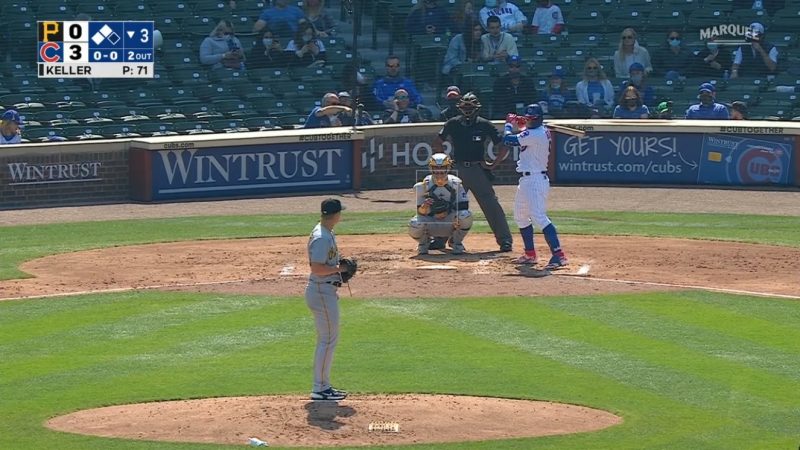
For as much as we complain about scorebugs being too large, I almost feel like this one is too *small,* with a lot of information crammed into as tight an area as possible. All the relevant data is there, however, so this could be worse.
MASN
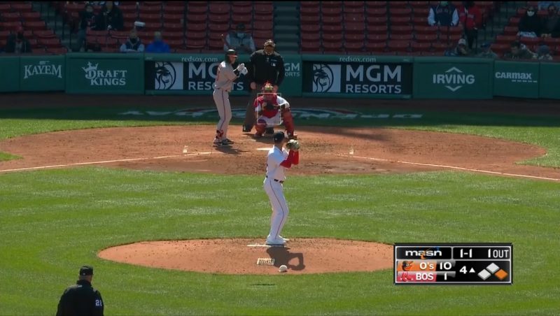
I have zero information to support this, but I feel like MASN has used the same general scorebug for years now. And with that being said, I don’t really like this one. No pitcher info? A big dumb MASN logo? Come on.
NBC Sports
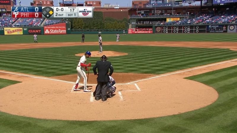
This scorebug is not small, that’s for sure (even ignoring the tacked on “Opening Week” logo). But it’s clean, informative, and easy to read. I feel like NBC could shrink it a bit more and lop off the team abbreviations, but overall, there isn’t much else to fix, aside from perhaps a change in placement (though isn’t that the ultimate matter of personal preference?).
NESN
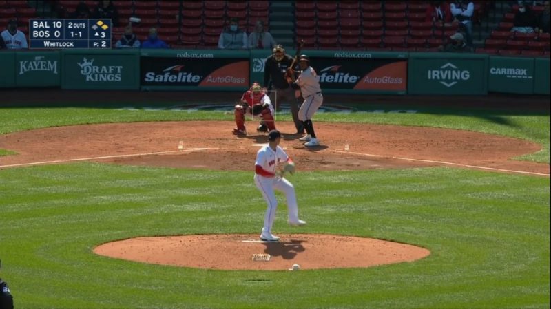
This is possibly the blandest scorebug I’ve ever seen. White on dark blue with yellow baserunners? Feel the excitement! This also reminds me of the Marquee scorebug, in that all the relevant info is there, but it’s packed in pretty tight.
SNY
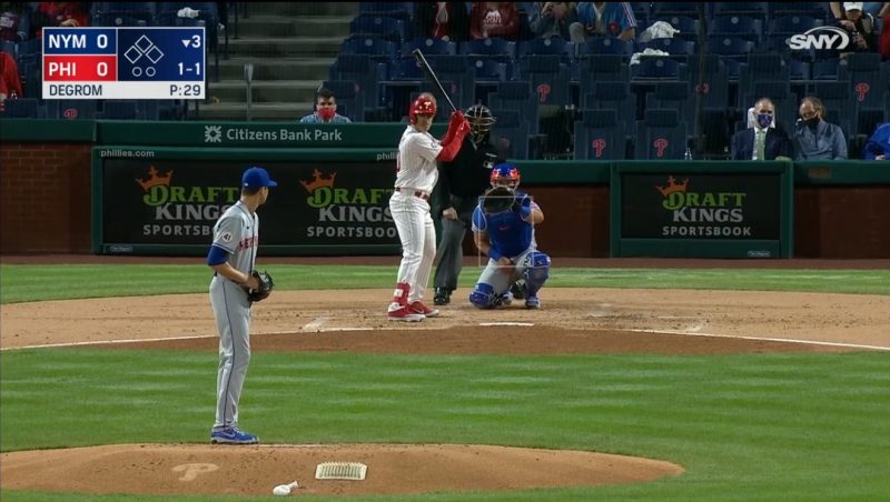
A little bland, don’t you think? This almost feels like something out of a video game that couldn’t get the rights to team logos. But all the necessary information is there and it’s not overly intrusive, so how much can we really complain?
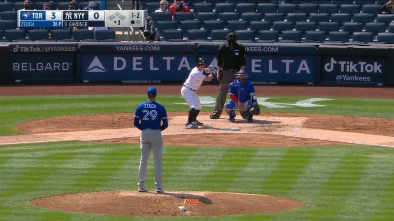
Sportsnet
The multiple different font sizes is a deal breaker for Sportsnet’s Blue Jays scorebug. It’s even more noticeable when the different fonts are stacked in the graphic, as they are here. This also leads to a bunch of dead space (on both the top and bottom of the scorebug) that could easily be lopped off.
SportsNet LA

I dig most of this scorebug, with the exception of how high it seems to be floating off the bottom of the screen. There’s a ton of info in this scorebug without much dead space, and while it’s not my favorite, I approve of it.
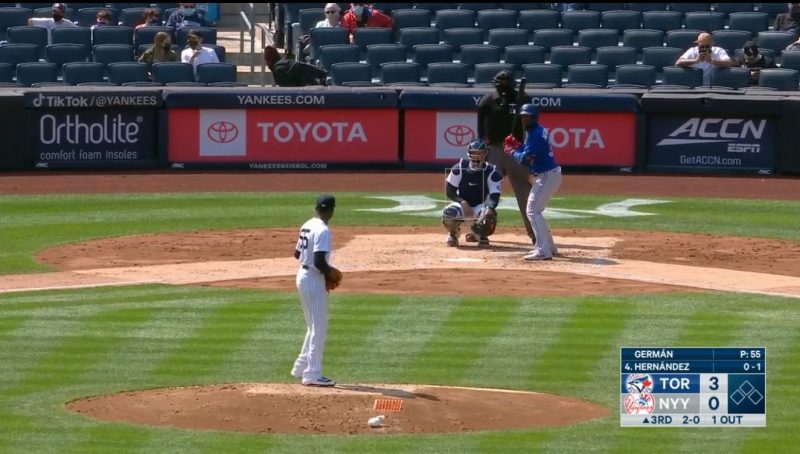
YES
This is way too wide, but it’s clean and has all the info I need. If it was a bit more appropriately sized, this would be a winner.
Now we turn it over to you: which RSN has your favorite MLB scorebug? Go ahead and vote in this totally scientific and binding poll.
