
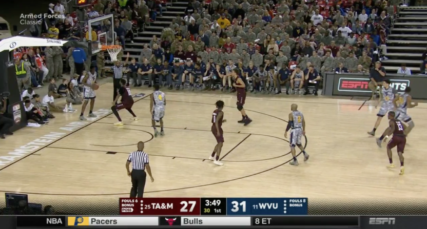
Last week, ESPN promised new graphics for their coverage of the upcoming college basketball season, and on Friday the network rolled out a brand new scorebug as well — one that’s bulkier and denser than we’re used to from the network. At first glance, it looks to have more text than previous ESPN score graphics, but upon closer examination, it contains all the same information, just packed a little tighter and in a bigger font.
See for yourself here:
The colors change depending on the teams playing, sometimes for better and sometimes for worse. Each version, however, features a transparent black bar extending to the side of the screen.
Get a load of the new scorebug for ESPN college hoops. pic.twitter.com/wLENmMfWdx
— Nick Loucks (@Nicks2Cents) November 10, 2017
What are your thoughts on the new ESPN scorebug? There's a right and a wrong answer here. pic.twitter.com/Ka9tc1BLqe
— Mid-Major Madness (@mid_madness) November 10, 2017
And here’s a reminder of what ESPN’s college basketball scorebug used to look like, for comparison.

Some of the information (fouls, possession arrow) that used to be hidden below the score is now next to it, in a display that kind of resembles cat whiskers. That, plus a more blocky text, makes the whole image seem a bit unwieldy.
The good people of Twitter were not necessarily fans of the new look.
Do not like the new ESPN scorebug.
— Paul (@HylianHero) November 10, 2017
https://twitter.com/Rovitz/status/929132649683279872
That new @ESPN scorebug is garbage. It’s the worst they’ve ever put out.
— Astro-Creep (@JOrtega95) November 10, 2017
https://twitter.com/thenatevaughan/status/929129800937148416
What the heck @ESPN? No tenths of a second on the scorebug? @awfulannouncing #UVUvsKENT
— Brent Maze (@bmaze) November 11, 2017
.@espn change your scorebug this is trash
— Sam Hiller (@SamHiller) November 10, 2017
https://twitter.com/aBrianLangford/status/929126001292070913
Not feelin the CBK scorebug on ESPN
— Dennis Zurbano (@Dennis_Zurbano) November 10, 2017
I️ already hate the new scoreboard graphic ESPN has for College basketball.
— Austin Burklund (@AB1132) November 10, 2017
I️ do not like the new scoreboard on ESPN in college hoops
— Matthew S (@sodapopscully) November 11, 2017
I'm really hoping this isn't the scoreboard ESPN plans on using this season… pic.twitter.com/OZrpXZknhq
— Riley Battaglini (@RilezB) November 10, 2017
https://twitter.com/MikeStrawMedia/status/929125885093011456
In ESPN’s defense, however, the scorebug does have some fans.
https://twitter.com/AVKingJames/status/929026395732369409
I actually really like the new ESPN scorebug for CBB.
— Rylan Stiles (@Rylan_Stiles) November 10, 2017
The ESPN CBB scorebug is alright. I don’t like the tire tracks on each side.
— https://linktr.ee/thispersonstinks (@tracytran) November 10, 2017
The new basketball scoreboard graphic on ESPN is 🔥🔥🔥 pic.twitter.com/ASWMCkxHgp
— Cade Carlton (@CadeCarlton) November 10, 2017
And a poll of Kansas fans showed popular opinion on the bug is only slightly negative.
Thoughts on the new ESPN scorebug graphics?
— Rock Chalk Blog (@RockChalkBlog) November 10, 2017
Whether you like or dislike ESPN’s graphic choices, you’re probably going to have to get used to them because there’s a whole lot of college basketball ahead.
