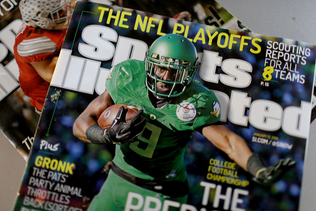
Sports Illustrated completely re-designed their website a couple of years ago and the results were less than spectacular. With more and more web traffic moving to mobile and tablet, Sports Illustrated attempt to focus their attention to those visitors with their re-design. It was supposed to be “flexible” and “more responsive.”
However, the experience in visiting the site was cumbersome to say the least, especially for desktop and laptop users. Articles were difficult to find, navigation was next-to-impossible, and if you got more than 1/3 of the way down the page you were reading, it was considered a minor miracle.
SI’s re-design was so bad it spawned countless tweets and even Reddit threads on its unfriendly user experience.
Nice work, Sports Illustrated, your new website is awful.
— Dave White (@YukonRadioDave) June 26, 2014
Have you tried to read an article on the Sports Illustrated website lately? I get 115 words then I have to scroll. It's terrible.
— Ruben Carlos Alonzo (@MoStateRCA) December 18, 2014
https://twitter.com/alexanderfulks/status/499589011208699904
Thankfully, Sports Illustrated has seen the error of their ways and debuted a new re-design on Thursday morning.
https://twitter.com/SInow/status/758618457940320256
Here’s what the new home page looks like:
Judging by the reaction, it’s a positive step:
https://twitter.com/hangerbm/status/758623865169936385
1/ Wow! Sports Illustrated @SInow listened to me and totally cleaned up its website such that you can look at it without having a seizure.
— bookofjoe (@bookofjoe) July 28, 2016
Hey, https://t.co/wlw2DomEaW finally replaced what was the worst website I've ever seen
— Gee (@piggenres) July 28, 2016
https://twitter.com/MattSBN/status/758633169600012288
Personally speaking, I know I visited the Sports Illustrated website much less under the 2014-2016 design because it was so awkward to get around, stories I wanted to read were difficult to find, and links I did click were a crapshoot from a functionality standpoint. Even SI’s own Richard Deitsch and Andy Staples shared their frustrations and the sentiment that the re-design hopes to gain back lost readers.
Truth: We lost of many digital readers because of SI's old site. Now we have to try to get them back. Begins today.
— Richard Deitsch (@richarddeitsch) July 28, 2016
Tired of waiting what feels like an hour for your SI(dot)com page to load? We were, too. https://t.co/wU2H0D9iUb
— Andy Staples (@Andy_Staples) July 28, 2016
So often in sports media (and pretty much every other realm), keeping it simple and functional can be an underrated method for success. If the SI website is cleaner and gives visitors a better experience, I’ll probably be going back because SI has a great collection of writers and insights.
If this new re-design can bring back readers that may have gone elsewhere with the old platform, then it will be worth its weight in gold.


Comments are closed.