
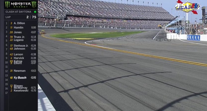
Fox kicked off its 2018 NASCAR coverage this weekend with Daytona 500 qualifying and the Advance Auto Parts Clash. One major change to the network’s broadcast was the location of their score ticker.
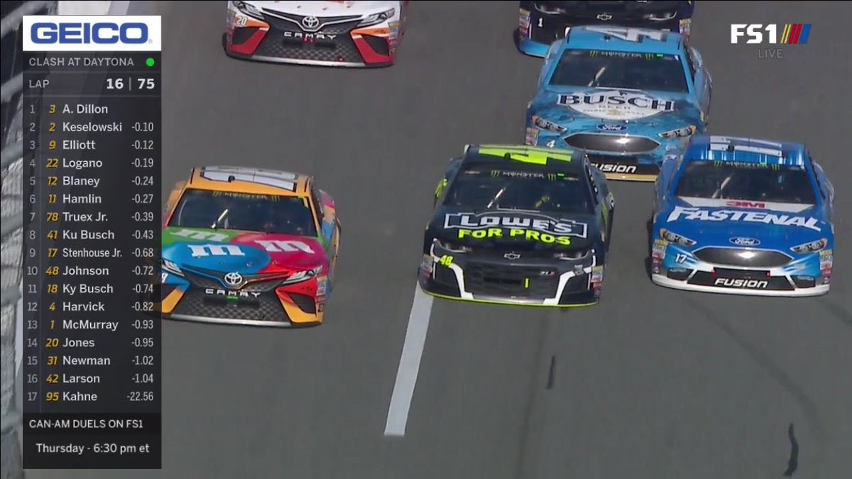
Usually placed on the top of the screen in recent years, the running order continuously went through the entire field and had some piece of info like distance behind the leader or lap speed below. Fox decided to put this on the left hand side of the screen where the top 10 would be permanently displayed with another 10 cycled through in three groups. There is certainly more information, but that wasn’t necessarily welcomed by fans who tuned in.
The new @NASCARONFOX sidebar has 317 characters to digest. The Gettysburg Address was only 272 words or 1196 characters. pic.twitter.com/ku4DgJmEQO
— Mike McCarthy (@mikemcc1717) February 11, 2018
A rough estimate, about 80 percent of the fan reaction on social media was negative. Many noted that the ticker was too big and took up too much of the screen. In addition, some of the information inside the ticker was cut off on some TV screens.
In terms of the size of the box, I don’t think it’s as big as some fans think it is, but it does take up about 15 to 20 percent of the screen. And if someone is watching the race on a smaller TV, or on a computer or mobile device, that could be an issue. As far as the information being cut off, that might not be Fox’s fault and could be a setting that needs to be adjusted. My dad was watching and had the same problem, so I had to talk him through changing the display because his TV was zoomed in. Normally, you wouldn’t notice but it was noticeable on Fox’s broadcast.
Personally, I liked Fox’s new NASCAR ticker. It’s clean and informative and it doesn’t matter if you have had the race on all day or you left and came back; you always know who the leaders are. That doesn’t mean it’s perfect and Fox could stand to make some tweaks to make it better.
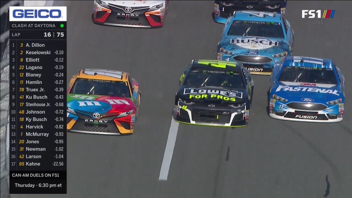
One issue I noticed was that camera operators weren’t compensating for the ticker on the left and sometimes cut off the cars. Having run a camera for sporting events, I have a feeling operators aren’t able to have the ticker marked on their screen, so they’re essentially guessing where the ticker is when they frame their shot.
And because of that, sometimes you get a situation like this.
https://twitter.com/GeoffreyMiller/status/962785270486786048
It’s important to note that the situation improved over time, but that is something to keep in mind going forward.
https://twitter.com/GeoffreyMiller/status/962786091102359553
Geoffrey Miller did a great job explaining how the ticker affected the broadcast and went into detail on his site. Miller showed on Twitter what the same camera shot looked like with and without the ticker.
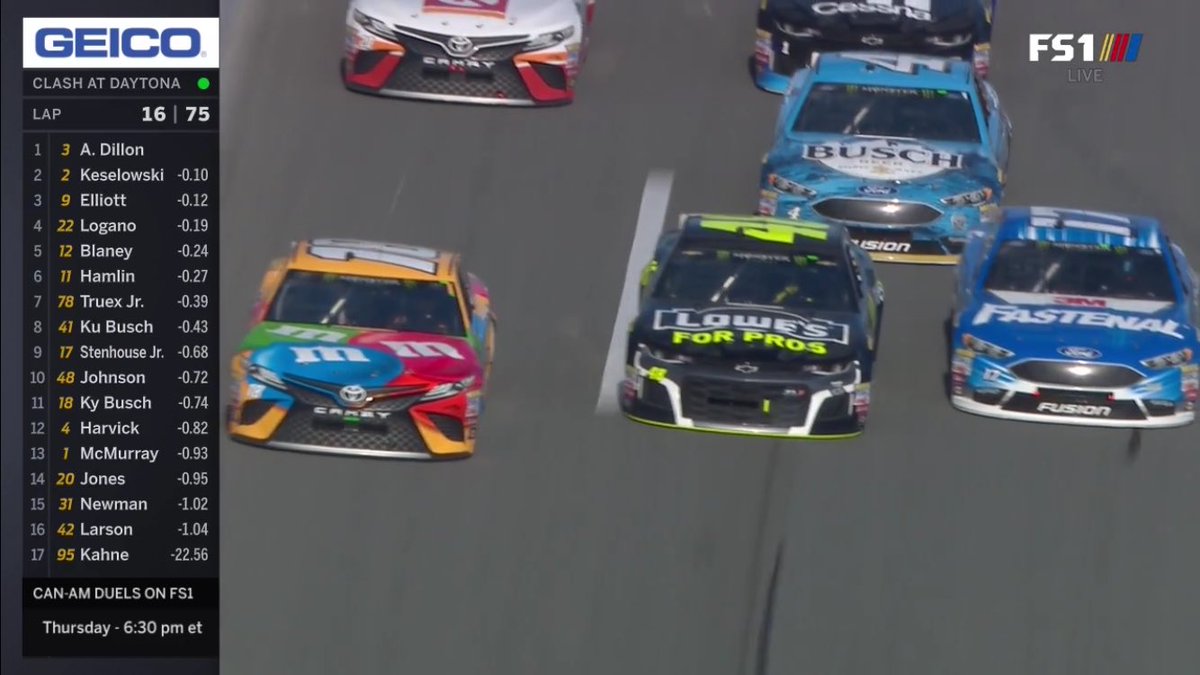
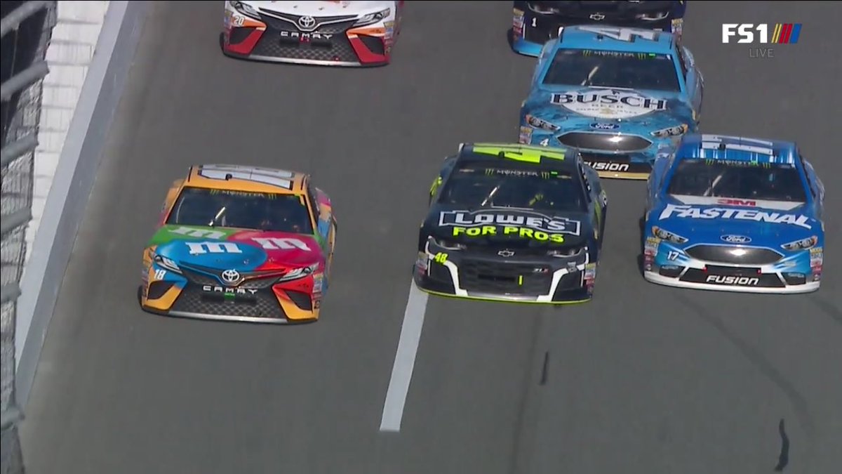
If this is the case, you lose a smaller amount of the action than you would think because the picture is slightly pinched, so all three cars are in the shot and no one misses any of the action.
There are many ideas to make the situation better and they work to a varying degree. Many want to see a smaller ticker and that’s a bit tough to do, but some suggested borrowing what Formula 1 does and insert a three-letter abbreviation of a driver’s name instead of their full last name. And then make the ticker smaller. This may not work because F1 periodically has their drivers’ full last names in their ticker and this may not be a realistic solution for newer fans who might not be as familiar with driver names, much less abbreviations.
Miller played around with the ticker by removing the border on the edges and made the ticker slightly transparent. In reality, I don’t think it gives viewers much more of the screen than they had anyway, but it does look more attractive and seems more incorporated in the broadcast than a sidebar which looks like it’s pushing the screen to the right.
That is a small and largely unnoticeable change, but it does improve things when putting this side-by-side. Just as it is for the drivers, the Clash is usually a dress rehearsal for Fox as they begin their season. Surely, Fox will make an improvement or two to their ticker before the Daytona 500 this Sunday.
