
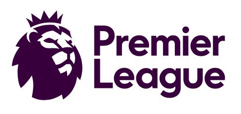
Today, the world’s most popular sports league gave its fans a look at the logo that will be used starting for the 2016-17 English Premier League campaign. The logo was unveiled in this tweet:
From next season, the Premier League is going to look a little bit different…https://t.co/4n4mNohG2Z
— Premier League (@premierleague) February 9, 2016
The secondary logo will just use initials with the league’s iconic lion:

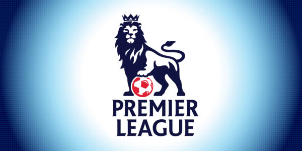
It certainly contrasts from the current logo which will go by the wayside after this season:
Of course, Twitter had some fun with the new logo:
https://twitter.com/kloppholic/status/697001018010288128
How the new Premier League logo should have been unveiled https://t.co/5pPWus2BLa
— B/R Football (@brfootball) February 9, 2016
@premierleague pic.twitter.com/UyDbJVMA4a
— zajebiscie (@zajebiscie) February 9, 2016
My nomination for the new Premier League logo was rejected. pic.twitter.com/beo8afqnjM
— Paul Carr (@PaulCarr) February 9, 2016
The Premier League’s new logo. With their #ChampionsLeague performances in recent years, we suggest an alternative. pic.twitter.com/UaNP33BEnf
— Bayern Central (@bayerncentral) February 9, 2016
https://twitter.com/chris78williams/status/696984231776534528
Exclusive: We go behind the scenes to see how the new Premier League logo was created. pic.twitter.com/c5ivN03AtS
— The Oatcake Fanzine (@oatcakescfc) February 9, 2016
The new logo will take some time getting used to, but needless to say social media certainly had some fun with it. The main omission is the “Barclays” sponsorship which has ended. But the Premier League’s global media contracts will certainly make up for any money lost from Barclays.
